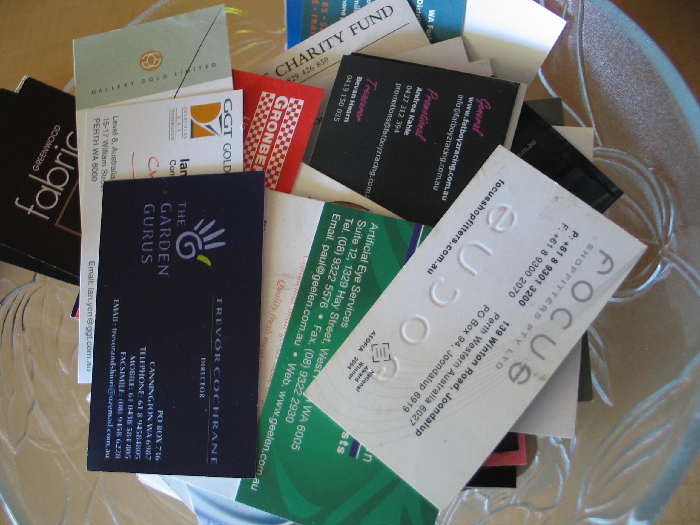
Business cards carry significant importance for the business’ recognition. It is one of the robust ways of promoting a business. But it does not mean that people take and have a look at the business card always. They certainly look at the cards if its design, colour, look and feel impress them. In other words, I want to say that every business card design should have some distinct qualities in them for which people will accept them and remember for sure. The design process of the card with some careful approach from your side will make it stand tall among the crowd.
The colour, typeface, image and graphics, size everything needs to be perfect and worth acceptable. If you want to attract the eyes, the colour need not be odd; rather make it shiny and appealing to eyes. On the other hand, business card designing need not to be very stylish in font type and size but the little style is the impression. The use of images and graphics needs to be minimal yet catchy.

A business card designing should have scope for creativity yet should never go beyond business standards. I mean to say some unconventional approach in touch and feel is great to attract the eyes and touch of the users (say embossed or letterpress effect) always help users to remember your business when he or she is in need of anything that you produce or serve.
The business card designing has to be very much clear with the message that it carries. The business purpose has to be clear to the viewers, and they need to understand how helpful will be your business in their need. Say your business is in the hospitality sector, and you cannot prove it with the card designing, your money and effort will go in vain. Try to make the design perfectly concerning your business.
Put the right information on your card to make it completely informative and useful. I am trying to emphasise on this point very much because sometimes in the process to go too much creative or stylish, business card designing goes less packed with valuable information. Never compromise with information; rather make the card managed with highlighted information.
With minimal text provided on it, let the users feel that you have some personal tone to talk or help him or her. A line for the business slogan that appeals the senses can bind the users to remember you. Even a multilingual card designing depending on the market base of the business happens to be good.
It is very much common affair that the business owners go to the designers and only say to give them a card that is different and catchy to the eyes. And when the work completes and cards go to the users, they find most of the cards useless (whatever out of the box design is). So remember it is your responsibility to make your business card designing a class and quality. If you can do so, you will see that your business card is different in its altogether design and feel.


